
Jane Gottlieb has built her life around color. Raised and based in Los Angeles, she started out painting, but her path shifted over the years—first to photography, then to hand-painting directly on photographic prints. Over three decades ago, she began transforming Cibachrome prints with vivid pigments, layering photography with a painter’s intuition. It was messy, deliberate, and personal.
Eventually, she brought her process into the digital age. She now scans her original works and reworks them in Photoshop, creating bold, high-energy prints on surfaces like aluminum, canvas, and paper. Her digital process doesn’t erase her past—it builds on it. Every piece begins with something tactile, and then it takes on new life through the screen.
Gottlieb’s art is loud in the best way—bright, unapologetic, and filled with motion. She doesn’t chase balance or realism. Her work is about joy, plain and simple. She leans into saturation and scale, and she believes deeply in the emotional pull of color. For her, it’s not just a design choice—it’s fuel. Her pieces are made to lift your mood, snap you awake, and make you feel something right away.
This energy comes through in her public installations too. UCLA and UCSB have more than 140 of her large-format prints installed across multiple buildings—meant to live there for ten years. She sees them not as decoration but as interventions. Splashes of color in neutral, everyday spaces. Reminders that life can still surprise you.
Frank Gehry Series
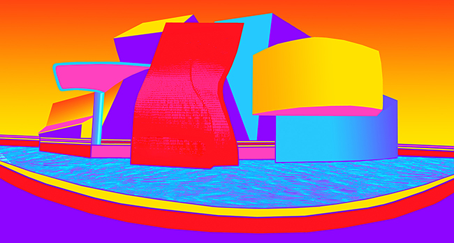
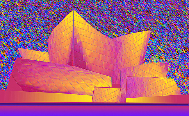
Jane Gottlieb’s Frank Gehry series feels like a reunion. Forty years ago, she was photographing his work directly. That early experience left an imprint. Since then, she’s kept going back—studying and shooting his buildings in Los Angeles, Bilbao, and beyond. This series is part tribute, part reimagining.
Her approach isn’t about preserving what’s there—it’s about playing with it. Gehry’s architecture already bends expectations, with its sweeping metal surfaces and unpredictable forms. Gottlieb leans in and takes it further. She shifts the palette, exaggerates the curves, and repositions the light. What starts as documentation becomes something else—something brighter, weirder, more animated.

Using Photoshop like a paintbrush, she takes Gehry’s steel and gives it a new skin: gradients of turquoise and magenta, hot pinks layered over orange skies, shadows replaced by pure fields of color. In one image, his structures float over neon water; in another, they rise against a digital dusk. The buildings still hold their form, but the environment is completely hers.
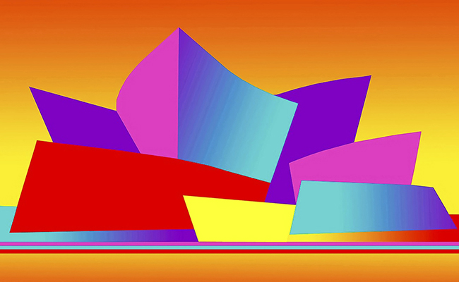
This series isn’t about realism. It’s about sensation. Gottlieb isn’t trying to show you what Gehry’s buildings look like—she’s showing you what they feel like when she sees them. That means freedom, scale, oddness, joy. She doesn’t shy away from manipulating the image. She wants it to burst.
These images have a surreal quality—like stills from a dreamscape or a hyper-color memory. Sometimes the sky fades into electric orange. Sometimes it disappears altogether. What’s constant is the energy. These aren’t calm or contemplative pictures. They’re alive. Almost humming.
At its heart, the series is about Gottlieb’s relationship with creativity itself. She’s drawn to architecture because it’s structured, permanent, physical. But she pushes it into a more fluid, emotional space. Where Gehry challenges what a building can be, she challenges how it can be seen.
She doesn’t aim for reverence. She plays. Her work isn’t precious. It’s open. It’s loose. And it’s entirely hers.
In the end, Jane Gottlieb isn’t just showing you Gehry’s buildings. She’s showing you what happens when someone gives themselves full permission to love color, push limits, and stay curious—for decades. That’s what makes these pieces feel both new and rooted. They’re the product of a long obsession and a steady hand, still finding ways to see familiar things in fresh, electric light.