
Oenone Hammersley’s work speaks from the ground up—through water, leaf, and sky. Her connection to the natural world is steady and instinctive. She’s not just inspired by rainforests, rivers, and wildlife—they’re central to how she sees and paints. Her art moves between the recognizable and the abstract, pulling in texture, light, and atmosphere to create something that feels both grounded and fluid. There’s no drama in her delivery, but a quiet insistence—an understanding that the natural world is both beautiful and endangered, and that we need to pay attention.
This fall and winter, Hammersley will show her work at several major art fairs. She’ll be part of Art 3F Paris from September 26–28, 2025, and Le Carrousel du Louvre Art Fair, October 17–19, 2025—both with Parcus Gallery. Later in the year, she’ll exhibit at Art Miami, December 2–8, 2025, with the Walter Wickiser Gallery. Her full body of work can be found at www.oenonehammersley.com.
The Rainbow River Series: Layers in Motion
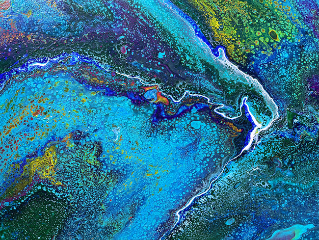
Rainbow River 1
In Rainbow River 1, you don’t see a river as much as you feel one. Deep and shifting blues make up the base—some nearly black, others as light as mist. The flow is suggested rather than drawn. It carries your eye along softly, without edges or clear destinations. Small hits of orange and green break through, like sunlight caught in water. There’s contrast, but nothing shouts. The painting moves at its own pace.
The textures vary. Some areas are smooth, others seem scraped or pulled. This roughness adds weight. It’s not a flat surface—it pushes and pulls. Hammersley gives the sense that the water has memory, that it carries more than just color. You’re not looking at a scene; you’re looking into one.
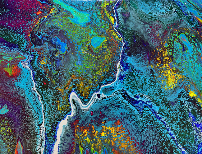
Rainbow River 2
The second painting turns warmer. Rainbow River 2 brings more greens, more oranges, and a deeper sense of movement. It still holds the calm of the first piece, but with an undertow of urgency. It feels like midday instead of morning. The base blues still exist, but they’ve made room for a different temperature—something brighter, closer, more alive.
The composition flows loosely, without rigid form. Shapes bleed and merge in ways that mimic how nature behaves—slightly unpredictable, always shifting. Some sections feel like they’re speeding up; others pull back. You get the sense that this painting is breathing. You’re not just observing it—you’re inside it.
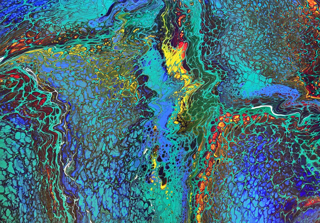
Rainbow River 3
The third piece feels like the culmination of the journey. Rainbow River 3 is wider, bolder. The blues are now a background voice to stronger bursts of red, yellow, and green. It feels like the river has overflowed, leaving behind not chaos, but a new energy. Color dominates, but doesn’t clash. Instead, it folds and turns, overlapping in patterns that seem organic and unpredictable.
Some paint sits boldly on the surface, sharp and quick. Other areas sink inward, subtle and slow. These layers—some obvious, some hidden—build tension and rhythm. It’s not a still painting. It moves, sometimes fast, sometimes slow, like nature adjusting to itself. There’s something restless in it. Something alive.
Taken together, the Rainbow River paintings are less about geography and more about feeling. They’re not maps, but moments—snapshots of water in motion, of change underway. Hammersley doesn’t define a river for us. She lets it shift, speak, and move the way real rivers do. There’s no single reading—just flow, contrast, and color working together.
The mood across the series is reflective, but not passive. These are not just decorative pieces. They ask something of you. To stay longer. To pay attention. To consider what beauty looks like when it’s fragile—and what it means to witness it while we still can.