
Paul “Gilby” Gilbertson approaches painting the way some people approach science: start with the materials, pay close attention, and keep testing until something clicks. In the early 1970s, he stumbled onto a watercolor method that would later become strongly linked to his work—dropping salt onto wet pigment to create textured, crystal-like patterns. It wasn’t a planned discovery, and it didn’t arrive with a neat explanation. It simply worked. The important part is that Gilbertson stayed with it. He kept exploring when salt produces the most interesting results, how it changes depending on timing and moisture, and how it can shift the feeling of a scene. Over time, what began as an accident became a steady tool in his studio—one that helps him build atmosphere and depth while keeping watercolor’s natural openness intact.
Watercolor demands a particular mindset. You make a decision, place the wash, and then you have to accept that water will keep moving on its own. Gilbertson seems at ease with that relationship. His paintings feel directed but not controlled to death. The surfaces remain airy. Transitions stay fluid. Soft edges appear where they make sense, then the image tightens up around key forms. Throughout, you can see the understated presence of salt: pigment splitting into small blooms and specks that suggest current, fog, moisture, or the fine grit that sits in real environments.
This is why the salt process matters in his work—it isn’t there to show off. It’s doing heavy lifting. It keeps larger passages from turning flat. It creates distance without thick layering. It also mirrors the textures we already associate with the natural world: sand and stone, water haze, sky that shifts minute to minute. In Gilbertson’s paintings, those marks don’t read as a gimmick. They read as air and water—space that feels believable.
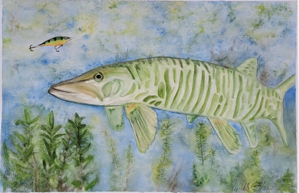
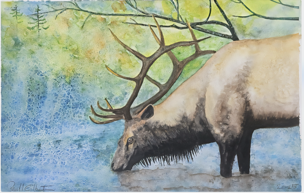
The two 2025 works you shared show how consistently he uses this approach while still letting each subject carry its own tone. One scene takes place underwater, with a large Musky moving through a cool field of blue and green. The other sits at the edge of a pool, where an elk bends down to drink. Together, they feel like they belong to the same visual world—quiet images with a gentle tension running underneath, where technique supports mood rather than overpowering it.
In the fish painting, the composition is straightforward and calm. The fish is large and centered, almost portrait-like—steady, present, and treated with care. Pale green striping runs along the body in a way that describes form without relying on hard outlines. The eye is crisp enough to give the fish personality and alertness. In the upper left, a lure floats nearby—small but meaningful. It introduces an implied storyline without spelling anything out: temptation, pursuit, and risk. Below, aquatic plants rise like a soft screen, adding depth and anchoring the scene. The surrounding wash—layered blues and greens broken by mottled texture—immediately reads as water. It doesn’t explain underwater space literally; it delivers the feeling of being inside it.
The elk painting shifts toward weight and grounding. The animal’s body fills much of the right side, and the lowered head captures a private moment—unposed, almost tender. The antlers extend outward and upward, echoing the branching lines above and creating a strong rhythm across the top of the piece. The background stays luminous, with greens and yellows suggesting foliage and light, while the left side holds an energetic blue field that feels like water and air blending together. Darker areas around the neck and legs add contrast and stability, keeping the painting from drifting into pure atmosphere. Again, there’s a clear balance: the elk is recognizable and specific, while the world around it remains open, painterly, and suggestive.
A defining strength in both works is Gilbertson’s restraint. He doesn’t overcrowd the page. He lets the paper breathe. He trusts the medium to carry part of the story. That kind of confidence comes from long practice—knowing when to stop working a passage, when to let a wash settle, and how to use texture to add complexity without making the image feel busy.
These two 2025 paintings sit within a continuing body of work that reflects Gilbertson’s long engagement with watercolor and his ongoing interest in nature as both subject and setting. They also connect to a larger effort beyond the studio. Gilbertson has established Gilby’s Foundation for the Arts, focused on donating artwork to help raise funds for nonprofit organizations and charities across America. It’s a practical extension of the values already present in the paintings: careful attention, respect for life, and a sense of stewardship.
Art conversations can get stuck on promotion and visibility. What stands out here is the added purpose—work that exists as imagery, but can also function as direct support. The foundation gives the paintings another role: not only scenes of wildlife and place, but objects that can contribute to helping others.
Ultimately, Gilbertson’s paintings resonate because they feel honest to watercolor itself. The medium exposes everything—your choices, your timing, your touch. It also shows when someone is forcing the outcome. In these works, you sense the opposite: steadiness, patience, and trust in what water can do. The salt textures—born from a chance moment decades ago—remain part of his visual language, not as a trick, but as a natural way of describing atmosphere. That’s what gives these scenes their quiet pull.
For more about the foundation, visit: www.GilbysFoundationfortheArts.info